PRINCESS POLLY UX RESEARCH
PRINCESS POLLY UX RESEARCH

Princess Polly UX Research
Scope: Website | Role: UX Researcher | Timeline: 1/24 - 3/24

Overview
Princess Polly is an Australian fashion brand known for delivering on-trend styles to Gen Z and Millennial audiences. As the brand expanded globally, ensuring a seamless and user-friendly online shopping experience became paramount. This UX case study focuses on evaluating and enhancing the digital journey for Princess Polly's customers, aiming to align the website's functionality with the brand's dynamic identity.
Objective
The goal of this project was to assess Princess Polly’s current website from a UX perspective and identify areas for improvement. By conducting research and analysis, the aim was to provide recommendations that would enhance user satisfaction, streamline navigation, and support brand growth.
This project was completed as part of my graduate ICM course at Quinnipiac University.
User-Centered Design Process
To guide the research process, I adapted key methods from the user-centered design process. While the full process includes five phases — 1. Empathize, 2. Define, 3. Ideate, 4. Prototype, and 5. Test — this project focused primarily on the first two, Empathize and Define.
The goal was to better understand Princess Polly’s users and clearly define their needs through a variety of research techniques.
Research Methods
Background Research
Competitor Analysis
Personas
*User Interviews
*User Surveys
Card Sort
*Diary Study
Heuristic Evaluation
Usability Testing
*These methods are hypothetical and were not conducted directly with users for this project. For more details, see the full report linked at the end of this case study.
Background Research
About Princess Polly
Princess Polly is an Australian-based online clothing boutique that markets their products mainly to young women. Per their business model, the company aims to provide customers with the trendiest, quality fashion on the market. On top of style and value, one of the company’s founding principles is superior customer service.
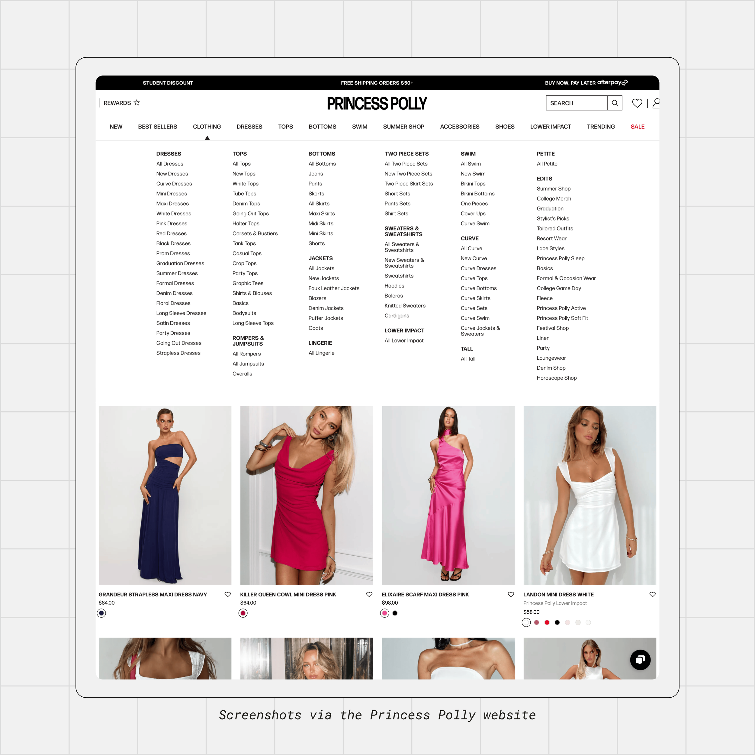
Current Website Overview: https://us.princesspolly.com
Observations:
Bold, maximalist design style. Use of all-caps and high contrast.
Aligned with trendy nature of their products, but layout feels overcrowded.
Large images create excessive scrolling
Despite clear category labels, navigation can be clunky.
Falls short in user intuitiveness (e.g. exploring color options for a product requires repeatedly hitting the back arrow to return to original page).
In short, the design captures the brand’s energy, but simplifying the interface and improving navigation would support better usability and encourage stronger customer engagement.
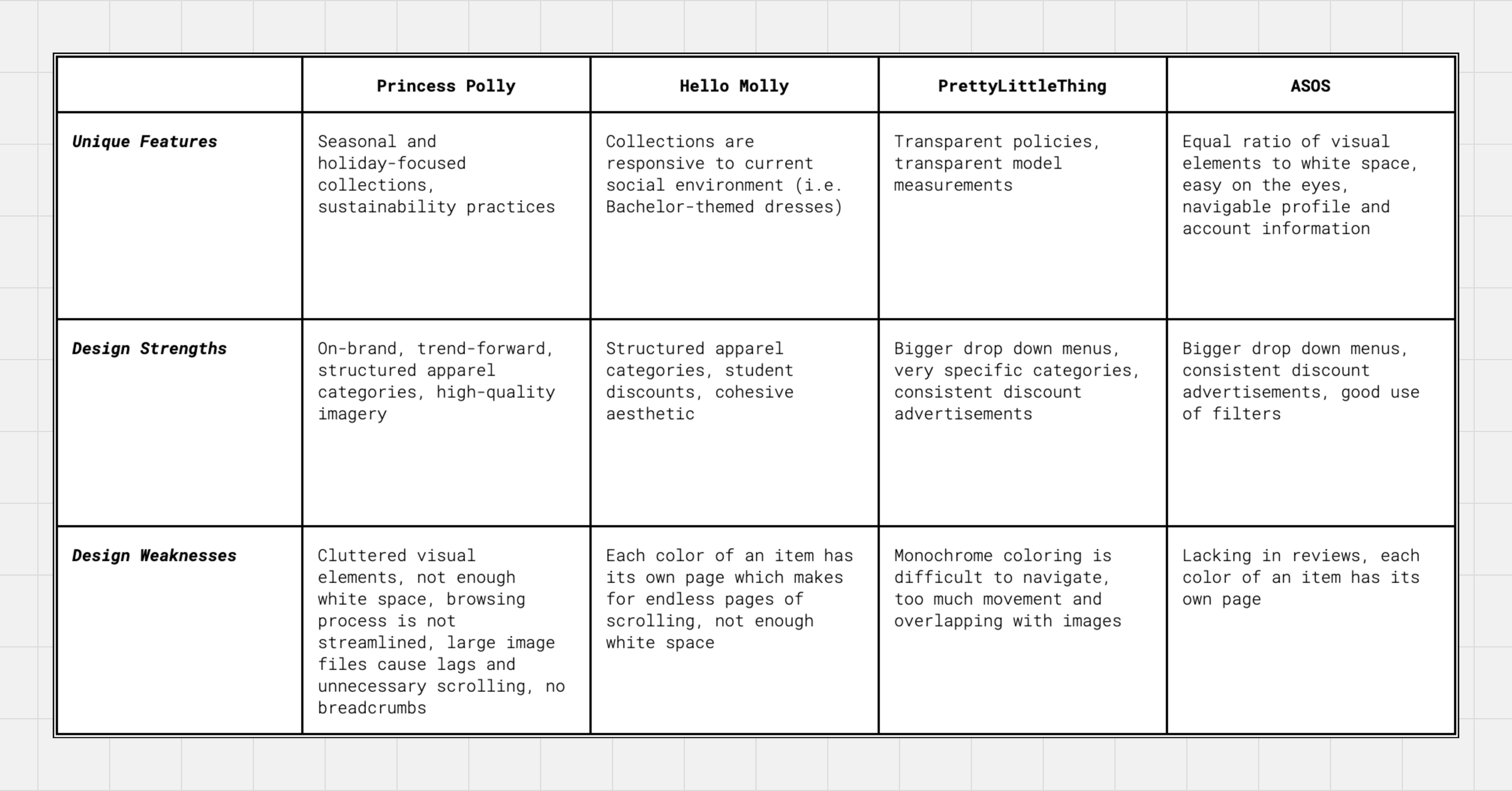
Competitor Analysis
By comparing Princess Polly to similar online retail sites like Hello Molly, PrettyLittleThing, and ASOS, I was able to see what features work well and where there was room for improvement.
Audit Highlights
Princess Polly rocks a trendy website, just like their competitors, with bold visuals and not a lot of white space. While this follows industry standards, it can be slow to load and overwhelming to navigate. Users might appreciate a simpler layout, even if it means sacrificing the aesthetics.


31 cards were presented during in-person individual sessions. Cards were developed using existing website page titles, links, and actions that users might take upon visiting the site. Sessions were recorded to capture nuanced data of each participant’s mannerisms and behaviors during the sorting process.
Observations
Participants 1 and 3 made seven groups, while Participant 2 made six groups.
Participants categorized cards similarly, but named certain categories differently.
Participants disagreed on the groupings of 14 cards.
No participants duplicated, renamed, added, or declined to use any cards.
Participants easily categorized items like “Tops” and “Dresses,” but struggled with specific categories like “Spring” and “Trending.” This suggested the main navigation and landing page layout might be confusing. A separate “Site Recommendations” menu could improve clarity.
Opinions differed on product details like descriptions and reviews. Two users preferred them on product pages, while one wanted them readily available on the landing page.
One interesting insight was the desire for a centralized location for order information (Shopping Bag, Track Orders, Shipping & Returns).
Findings
Heuristics that caused the most concern were:
User control and freedom
Error Prevention
Flexibility and Efficiency of Use
Aesthetic and Minimalist Design
Again, I encountered the problem of poor breadcrumb history when toggling between pages. Size filters sometimes showed out-of-stock products, which was frustrating. The overall design is cluttered and could use an update. Simplifying the layout, fixing the navigation, and correcting filter discrepancies would make for a more seamless shopping process.


User Feedback
Participants were able to finish tasks with an 80% completion rate.
Website resources are relevant, but the disorganization and information inconsistencies need to be revised.
Website terminology should be updated to account for users who are not as comfortable with the brand or online shopping.
Incomplete filtered search options created confusion for those looking for specific products.
Overall, a more standardized, understandable, and detailed design would greatly improve usability of the Princess Polly website.
Task 1: You have a formal event coming up and are looking for a quality floor-length evening gown to wear. Pick a dress and find out its material composition and care instructions. Then determine which size would be best for you.
Task 2: You support sustainable fashion and are constantly looking for brands that participate in these efforts. Determine if Princess Polly has any sustainability practices and figure out how they source their materials.
Task 3: You find a lot of your fashion inspiration from influencers on Instagram. Figure out how you can find specific Princess Polly outfits worn and posted by your favorite influencers, and navigate to those products.
Task 4: You prefer to use Afterpay as your primary method of payment on most retail sites because the installments make more sense for your financial situation. You purchased a top two weeks ago and wish to return it. Figure out how you will be refunded.
Task 5: As a loyal Princess Polly customer, you’re very interested in the exclusive collections they offer, especially those practiced with sustainability in mind. Find a silver bracelet that was ethically sourced and add it to your shopping cart.
Strengthen Wayfinding
Improve breadcrumb functionality to help users easily navigate between product colors and pages.Revise Terminology for Clarity
Replace niche terms like “Edits” and “Lower Impact” with more universal labels such as “Shop By” or “Collections.”Consolidate Shopping Tools
Create an all-in-one purchasing hub with access to the shopping cart, shipping and return info, order history, and tracking.Reorganize Sustainability Content
Group sustainability information into clearly labeled sections using visuals like graphs and bullet points for easier understanding.Increase Transparency in Ethical Sourcing
Make audit results, sustainability standards and efforts, and the Material Guide easy to find and consistent across all relevant pages.
Given the size and complexity of the Princess Polly website, there are still plenty of features worth exploring further. I would especially be interested in testing users on the site’s current accessibility features and rewards program, both of which present strong opportunities for continued research.
Personas
To gain a deeper understanding of Princess Polly’s core user base, we’ve developed detailed customer personas. These three personas - Maddie, Taylor, and Sarah - represent realistic archetypes of their target audience and are based on practical shopping scenarios.

Card Sort
In this study, participants grouped labeled cards based on their logic, revealing their mental models of certain products, or in this case, the Princess Polly website. This quick method provided valuable insights for building a user-friendly website structure. Three Princess Polly users participated in this open card sorting test.
Similarity Matrix

Heuristic Evaluation
I examined Princess Polly’s website using ten well-established principles of usability in a heuristic evaluation. These principles are based on how people naturally think and navigate websites. By going through specific tasks and identifying areas where the website breaks these rules, I was able to pinpoint where improvements were needed.
Usability Testing
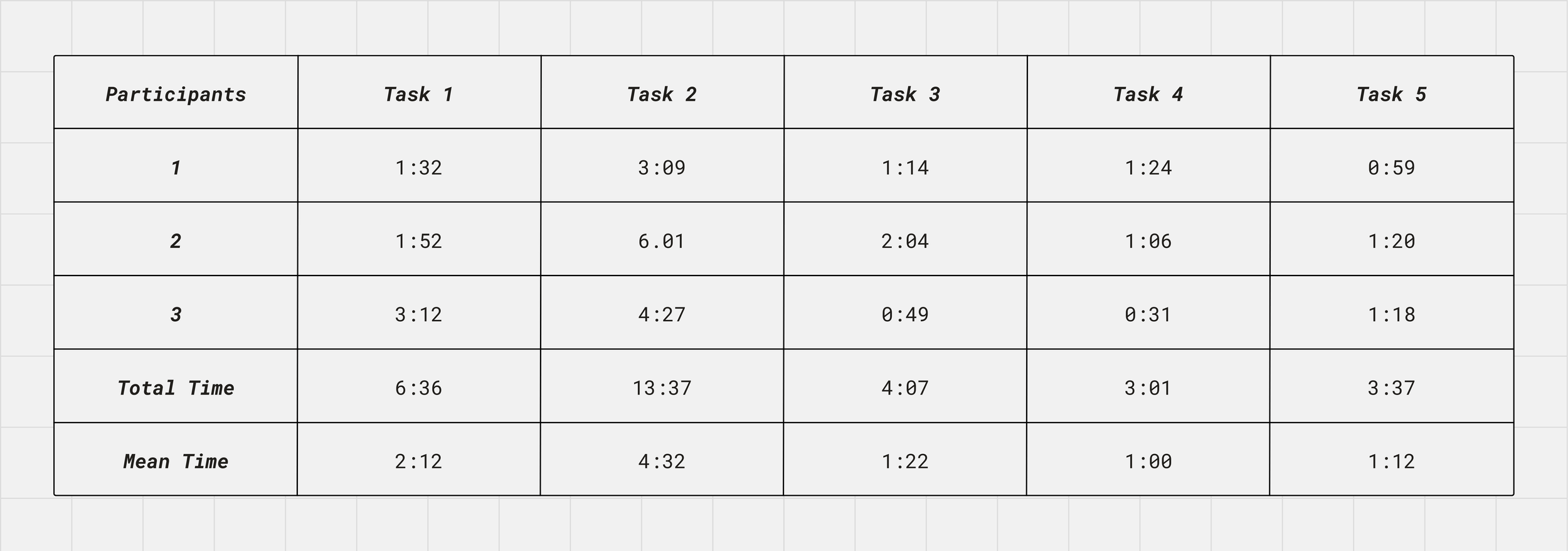
To wrap up the research phase, I conducted usability testing with three participants using Apple’s QuickTime Player. The goal was to identify pain points within the Princess Polly website based on real user interactions.
Each participant was given five tasks to complete (as listed below), and as they worked through them, I tracked how long each task took, noted key observations, and asked follow-up questions to better understand their thought process. During these individual testing sessions, participants communicated their thought processes as they spent time with the product.
After reviewing the sessions, I was able to pull insights and make informed recommendations for improving the site’s user experience.
Tasks
Task Timings
Recommendations
Simplify Visual Design
Use smaller imagery, consistent fonts and colors, and increased white space across the site for a cleaner, less overwhelming experience.Refine Search Functionality
Avoid auto-populated results before user input, and expand the search tool to include all site content—not just products.Improve Filtering Options
Include more accurate size filters, add “Maxi Dresses” as a style filter, and revise the jewelry “Color” filter to “Metal” with appropriate options.Streamline Navigation
Clarify the difference between core clothing categories and curated collections or trends to reduce confusion.Enhance Product Pages
Add separate tabs for materials and wash care, display customer reviews, and add a “Recently Viewed” section for easier browsing.
Next Steps
With the first two phases of the user-centered design process complete, the next steps can begin. The research findings and participant feedback gathered so far will be essential as the project moves into wireframing and future usability testing. Bringing the recommendations to life through mockups and testing them with users will be an exciting next phase.
Search functionality is a key difference. Unlike competitors, Princess Polly auto-populates results before a search is complete, which can be distracting. Also, returning to filtered searches requires extra clicks. A cleaner design with more white space, no auto-filled results, and simpler navigation would improve user experience.
These personas allowed me to empathize with the user experience, enhance recall of their needs, and ultimately guide design choices that cater to their preferences.
What I Learned
This project gave me a deeper understanding of how research drives good design. Working through each phase helped me slow down, ask the right questions, and focus on what users actually need — not just what looks good on the screen. It was rewarding to identify real usability issues and translate them into clear, actionable next steps.
I also learned how important it is to approach UX with curiosity. The more I explored, the more opportunities I found to improve the experience. This process reminded me that strong design is not just about making something usable — it’s about making it work better for people.