FOLK FEST EVENT COLLATERAL
FOLK FEST EVENT COLLATERAL

Folk Fest Event Collateral
Scope: Event Marketing Collateral | Role: Graphic Designer | Timeline: 3/24 - 4/24
Overview
Newport Folk Festival is a longtime New England music weekend known for its history, community, and coastal setting. For the 2024 festival, new branding was needed for all promotional materials, including posters, flyers, social media graphics, tickets, and merchandise. I created a full event collateral package that reflects the festival’s iconic identity while bringing the new season to life.
Objective
As the graphic designer, I was responsible for developing a branding concept for the 2024 festival and applying it across the full suite of materials. Each piece needed to feel cohesive, capture the spirit of Folk Fest, and stay true to the event’s identity while connecting with this year’s audience.
This project was completed as part of my graduate ICM course at Quinnipiac University.
1
Research & Discovery
2
Initial Design Concepts
3
Refinement & Expansion
Research & Discovery
I started by looking at past Newport Folk Festival branding to understand how the festival has visually evolved while staying true to its roots. I also reviewed their social media presence to see how they currently connect with their audience and what types of content get the most traction.

Initial Design Concepts
To kick off the design phase, I created three distinct brand kits, each built around a different color palette. While the typography and main design elements stayed consistent, the palettes explored different ways to reflect the Folk Fest vibe — folksy, coastal, vintage yet slightly modern, and natural.

To broaden my perspective, I looked at marketing materials from similar festivals and pulled inspiration from what stood out. I also considered who the audience is — longtime fans, first-timers, and the artists themselves — and what would resonate across all areas of interest.

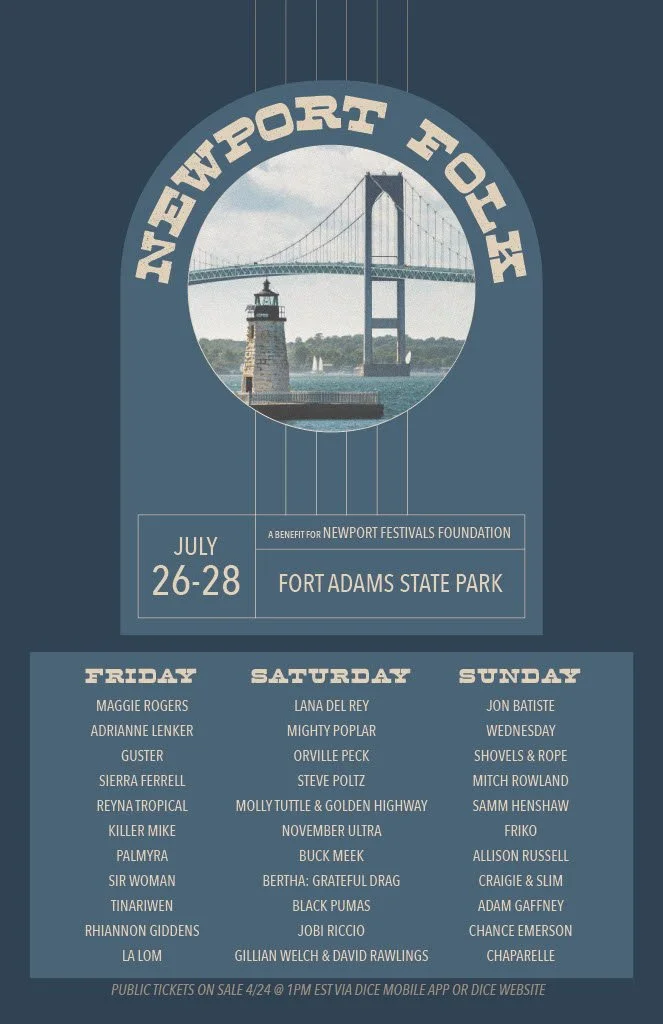
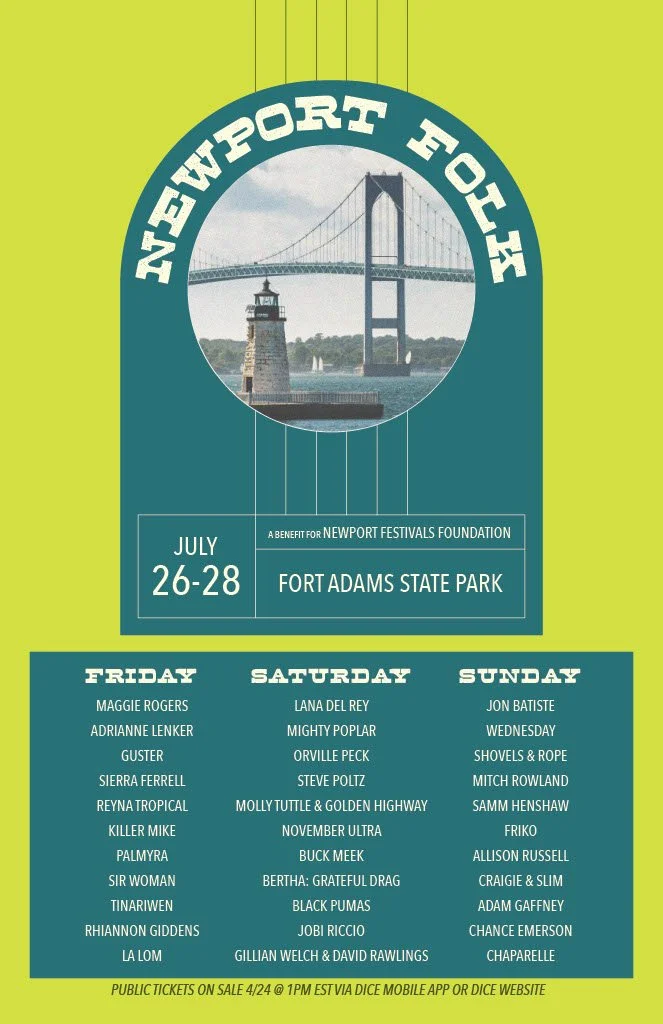
I designed an initial poster for each palette to help visualize the creative direction. After receiving feedback, I moved forward with the middle design which featured a warmer, more welcoming palette. I worked to honor the event’s roots while weaving in subtle shapes that hint at guitars and strings to tie back to the festival’s musical identity.
Refinement & Expansion
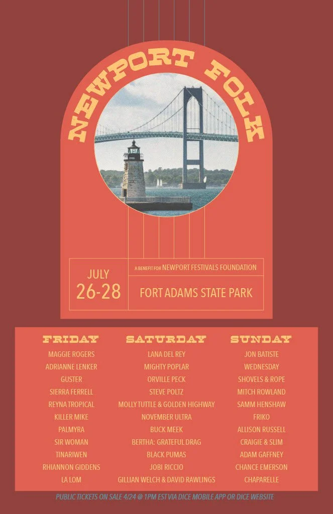
After reviewing feedback on the initial concepts, I refined the chosen direction by making small adjustments to the layout, color balance, and graphic elements. Once the new branding was finalized, I expanded the system across a full suite of event materials. This included an updated poster design, event flyers, Facebook page elements, Instagram posts, ticket designs for both general admission and VIP, and a t-shirt design with a full mockup.
Poster
Flyer

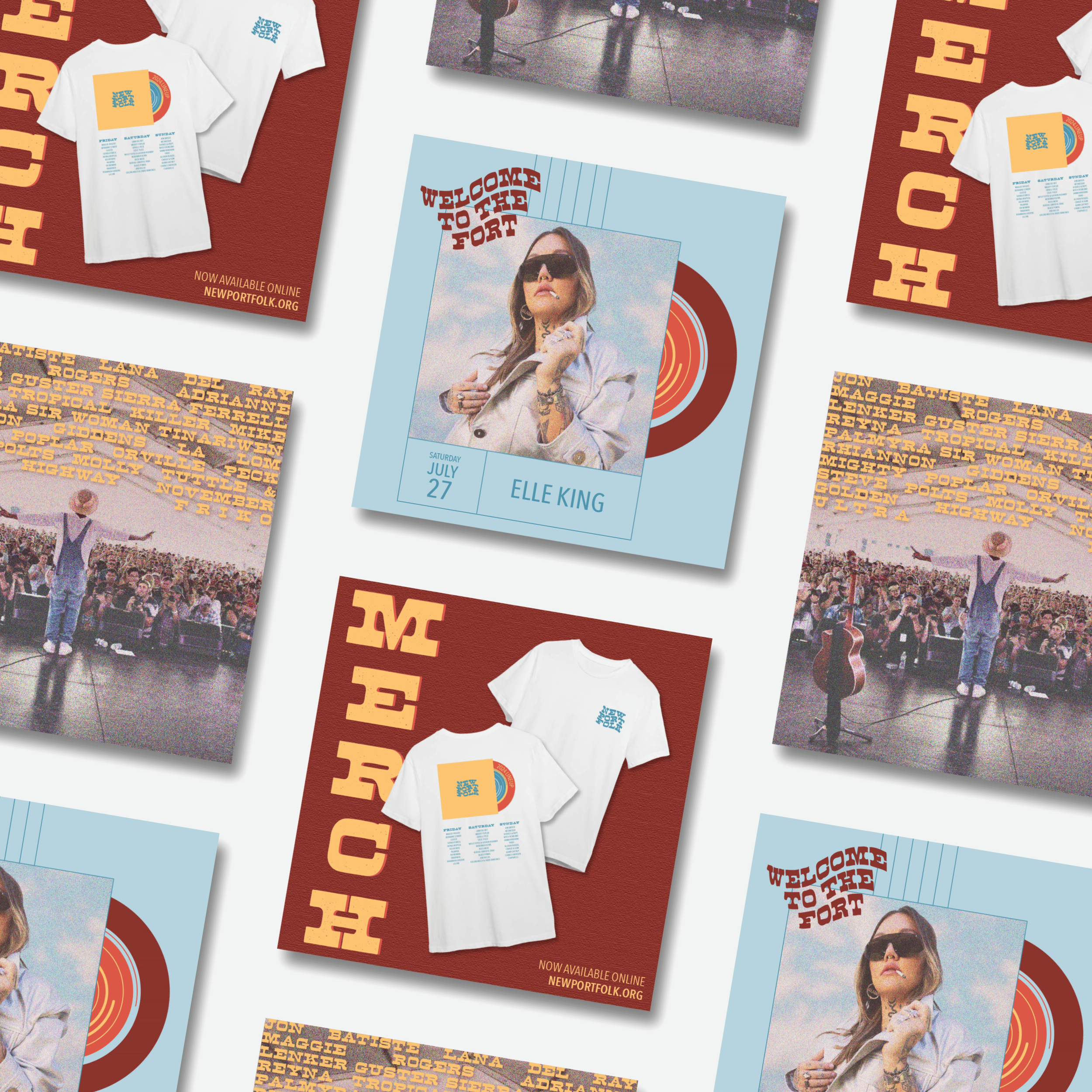
Instagram Content

The poster, flyer, tickets, and t-shirt were all created not only to promote the event, but also to serve as meaningful keepsakes that festival attendees could take home as a reminder of their experience. Every design stayed true to the spirit of Folk Fest while giving the 2024 event its own distinct visual identity.
Tickets

T-Shirt Design


Facebook Page


What I Learned
This project gave me the chance to fully own the creative process from start to finish, which was both challenging and empowering. Being responsible for everything — from developing the brand direction to designing each piece in the suite — helped me grow more confident in my design instincts and decision-making. It also reminded me how much I love creating work that feels both intentional and memorable, especially for events where the experience lives on long after the weekend ends.